2009 temperatures by Jim Hansen
This is Hansen et al’s end of year summary for 2009 (with a couple of minor edits). Update: A final version of this text is available here.
If It’s That Warm, How Come It’s So Damned Cold?
by James Hansen, Reto Ruedy, Makiko Sato, and Ken Lo
The past year, 2009, tied as the second warmest year in the 130 years of global instrumental temperature records, in the surface temperature analysis of the NASA Goddard Institute for Space Studies (GISS). The Southern Hemisphere set a record as the warmest year for that half of the world. Global mean temperature, as shown in Figure 1a, was 0.57°C (1.0°F) warmer than climatology (the 1951-1980 base period). Southern Hemisphere mean temperature, as shown in Figure 1b, was 0.49°C (0.88°F) warmer than in the period of climatology.
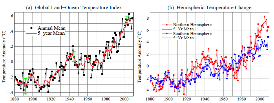
Figure 1. (a) GISS analysis of global surface temperature change. Green vertical bar is estimated 95 percent confidence range (two standard deviations) for annual temperature change. (b) Hemispheric temperature change in GISS analysis. (Base period is 1951-1980. This base period is fixed consistently in GISS temperature analysis papers – see References. Base period 1961-1990 is used for comparison with published HadCRUT analyses in Figures 3 and 4.)
The global record warm year, in the period of near-global instrumental measurements (since the late 1800s), was 2005. Sometimes it is asserted that 1998 was the warmest year. The origin of this confusion is discussed below. There is a high degree of interannual (year‐to‐year) and decadal variability in both global and hemispheric temperatures. Underlying this variability, however, is a long‐term warming trend that has become strong and persistent over the past three decades. The long‐term trends are more apparent when temperature is averaged over several years. The 60‐month (5‐year) and 132 month (11‐year) running mean temperatures are shown in Figure 2 for the globe and the hemispheres. The 5‐year mean is sufficient to reduce the effect of the El Niño – La Niña cycles of tropical climate. The 11‐year mean minimizes the effect of solar variability – the brightness of the sun varies by a measurable amount over the sunspot cycle, which is typically of 10‐12 year duration.
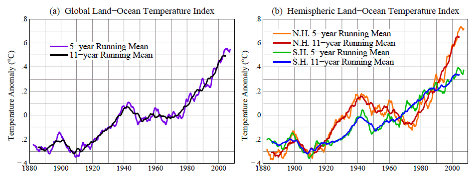
Figure 2. 60‐month (5‐year) and 132 month (11‐year) running mean temperatures in the GISS analysis of (a) global and (b) hemispheric surface temperature change. (Base period is 1951‐1980.)
There is a contradiction between the observed continued warming trend and popular perceptions about climate trends. Frequent statements include: “There has been global cooling over the past decade.” “Global warming stopped in 1998.” “1998 is the warmest year in the record.” Such statements have been repeated so often that most of the public seems to accept them as being true. However, based on our data, such statements are not correct. The origin of this contradiction probably lies in part in differences between the GISS and HadCRUT temperature analyses (HadCRUT is the joint Hadley Centre/University of East Anglia Climatic Research Unit temperature analysis). Indeed, HadCRUT finds 1998 to be the warmest year in their record. In addition, popular belief that the world is cooling is reinforced by cold weather anomalies in the United States in the summer of 2009 and cold anomalies in much of the Northern Hemisphere in December 2009. Here we first show the main reason for the difference between the GISS and HadCRUT analyses. Then we examine the 2009 regional temperature anomalies in the context of global temperatures.
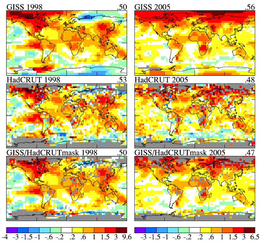
Figure 3. Temperature anomalies in 1998 (left column) and 2005 (right column). Top row is GISS analysis, middle row is HadCRUT analysis, and bottom row is the GISS analysis masked to the same area and resolution as the HadCRUT analysis. [Base period is 1961‐1990.]
Figure 3 shows maps of GISS and HadCRUT 1998 and 2005 temperature anomalies relative to base period 1961‐1990 (the base period used by HadCRUT). The temperature anomalies are at a 5 degree‐by‐5 degree resolution for the GISS data to match that in the HadCRUT analysis. In the lower two maps we display the GISS data masked to the same area and resolution as the HadCRUT analysis. The “masked” GISS data let us quantify the extent to which the difference between the GISS and HadCRUT analyses is due to the data interpolation and extrapolation that occurs in the GISS analysis. The GISS analysis assigns a temperature anomaly to many gridboxes that do not contain measurement data, specifically all gridboxes located within 1200 km of one or more stations that do have defined temperature anomalies.
The rationale for this aspect of the GISS analysis is based on the fact that temperature anomaly patterns tend to be large scale. For example, if it is an unusually cold winter in New York, it is probably unusually cold in Philadelphia too. This fact suggests that it may be better to assign a temperature anomaly based on the nearest stations for a gridbox that contains no observing stations, rather than excluding that gridbox from the global analysis. Tests of this assumption are described in our papers referenced below.
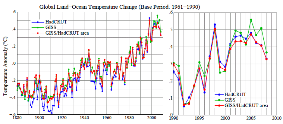
Figure 4. Global surface temperature anomalies relative to 1961‐1990 base period for three cases: HadCRUT, GISS, and GISS anomalies limited to the HadCRUT area. [To obtain consistent time series for the HadCRUT and GISS global means, monthly results were averaged over regions with defined temperature anomalies within four latitude zones (90N‐25N, 25N‐Equator, Equator‐25S, 25S‐90S); the global average then weights these zones by the true area of the full zones, and the annual means are based on those monthly global means.]
Figure 4 shows time series of global temperature for the GISS and HadCRUT analyses, as well as for the GISS analysis masked to the HadCRUT data region. This figure reveals that the differences that have developed between the GISS and HadCRUT global temperatures during the past few decades are due primarily to the extension of the GISS analysis into regions that are excluded from the HadCRUT analysis. The GISS and HadCRUT results are similar during this period, when the analyses are limited to exactly the same area. The GISS analysis also finds 1998 as the warmest year, if analysis is limited to the masked area. The question then becomes: how valid are the extrapolations and interpolation in the GISS analysis? If the temperature anomaly scale is adjusted such that the global mean anomaly is zero, the patterns of warm and cool regions have realistic‐looking meteorological patterns, providing qualitative support for the data extensions. However, we would like a quantitative measure of the uncertainty in our estimate of the global temperature anomaly caused by the fact that the spatial distribution of measurements is incomplete. One way to estimate that uncertainty, or possible error, can be obtained via use of the complete time series of global surface temperature data generated by a global climate model that has been demonstrated to have realistic spatial and temporal variability of surface temperature. We can sample this data set at only the locations where measurement stations exist, use this sub‐sample of data to estimate global temperature change with the GISS analysis method, and compare the result with the “perfect” knowledge of global temperature provided by the data at all gridpoints.
| 1880‐1900 | 1900‐1950 | 1960‐2008 | |
|---|---|---|---|
| Meteorological Stations | 0.2 | 0.15 | 0.08 |
| Land‐Ocean Index | 0.08 | 0.05 | 0.05 |
Table 1. Two‐sigma error estimate versus period for meteorological stations and land‐ocean index.
Table 1 shows the derived error due to incomplete coverage of stations. As expected, the error was larger at early dates when station coverage was poorer. Also the error is much larger when data are available only from meteorological stations, without ship or satellite measurements for ocean areas. In recent decades the 2‐sigma uncertainty (95 percent confidence of being within that range, ~2‐3 percent chance of being outside that range in a specific direction) has been about 0.05°C. The incomplete coverage of stations is the primary cause of uncertainty in comparing nearby years, for which the effect of more systematic errors such as urban warming is small.
Additional sources of error become important when comparing temperature anomalies separated by longer periods. The most well‐known source of long‐term error is “urban warming”, human‐made local warming caused by energy use and alterations of the natural environment. Various other errors affecting the estimates of long‐term temperature change are described comprehensively in a large number of papers by Tom Karl and his associates at the NOAA National Climate Data Center. The GISS temperature analysis corrects for urban effects by adjusting the long‐term trends of urban stations to be consistent with the trends at nearby rural stations, with urban locations identified either by population or satellite‐observed night lights. In a paper in preparation we demonstrate that the population and night light approaches yield similar results on global average. The additional error caused by factors other than incomplete spatial coverage is estimated to be of the order of 0.1°C on time scales of several decades to a century, this estimate necessarily being partly subjective. The estimated total uncertainty in global mean temperature anomaly with land and ocean data included thus is similar to the error estimate in the first line of Table 1, i.e., the error due to limited spatial coverage when only meteorological stations are included.
Now let’s consider whether we can specify a rank among the recent global annual temperatures, i.e., which year is warmest, second warmest, etc. Figure 1a shows 2009 as the second warmest year, but it is so close to 1998, 2002, 2003, 2006, and 2007 that we must declare these years as being in a virtual tie as the second warmest year. The maximum difference among these in the GISS analysis is ~0.03°C (2009 being the warmest among those years and 2006 the coolest). This range is approximately equal to our 1‐sigma uncertainty of ~0.025°C, which is the reason for stating that these five years are tied for second warmest.
The year 2005 is 0.061°C warmer than 1998 in our analysis. So how certain are we that 2005 was warmer than 1998? Given the standard deviation of ~0.025°C for the estimated error, we can estimate the probability that 1998 was warmer than 2005 as follows. The chance that 1998 is 0.025°C warmer than our estimated value is about (1 – 0.68)/2 = 0.16. The chance that 2005 is 0.025°C cooler than our estimate is also 0.16. The probability of both of these is ~0.03 (3 percent). Integrating over the tail of the distribution and accounting for the 2005‐1998 temperature difference being 0.61°C alters the estimate in opposite directions. For the moment let us just say that the chance that 1998 is warmer than 2005, given our temperature analysis, is at most no more than about 10 percent. Therefore, we can say with a reasonable degree of confidence that 2005 is the warmest year in the period of instrumental data.
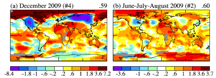
Figure 5. (a) global map of December 2009 anomaly, (b) global map of Jun‐Jul‐Aug 2009 anomaly. #4 and #2 indicate that December 2009 and JJA are the 4th and 2nd warmest globally for those periods.
What about the claim that the Earth’s surface has been cooling over the past decade? That issue can be addressed with a far higher degree of confidence, because the error due to incomplete spatial coverage of measurements becomes much smaller when averaged over several years. The 2‐sigma error in the 5‐year running‐mean temperature anomaly shown in Figure 2, is about a factor of two smaller than the annual mean uncertainty, thus 0.02‐0.03°C. Given that the change of 5‐year‐mean global temperature anomaly is about 0.2°C over the past decade, we can conclude that the world has become warmer over the past decade, not cooler.
Why are some people so readily convinced of a false conclusion, that the world is really experiencing a cooling trend? That gullibility probably has a lot to do with regional short‐term temperature fluctuations, which are an order of magnitude larger than global average annual anomalies. Yet many lay people do understand the distinction between regional short‐term anomalies and global trends. For example, here is comment posted by “frogbandit” at 8:38p.m. 1/6/2010 on City Bright blog:
“I wonder about the people who use cold weather to say that the globe is cooling. It forgets that global warming has a global component and that its a trend, not an everyday thing. I hear people down in the lower 48 say its really cold this winter. That ain’t true so far up here in Alaska. Bethel, Alaska, had a brown Christmas. Here in Anchorage, the temperature today is 31[ºF]. I can’t say based on the fact Anchorage and Bethel are warm so far this winter that we have global warming. That would be a really dumb argument to think my weather pattern is being experienced even in the rest of the United States, much less globally.”
What frogbandit is saying is illustrated by the global map of temperature anomalies in December 2009 (Figure 5a). There were strong negative temperature anomalies at middle latitudes in the Northern Hemisphere, as great as ‐8°C in Siberia, averaged over the month. But the temperature anomaly in the Arctic was as great as +7°C. The cold December perhaps reaffirmed an impression gained by Americans from the unusually cool 2009 summer. There was a large region in the United States and Canada in June‐July‐August with a negative temperature anomaly greater than 1°C, the largest negative anomaly on the planet.
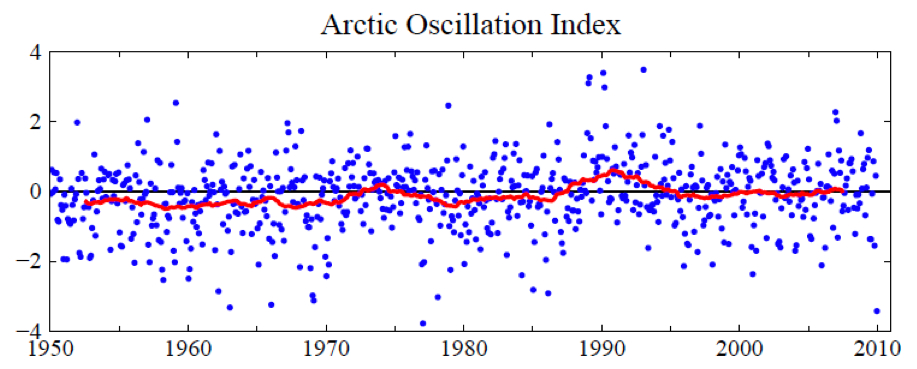
Figure 6. Arctic Oscillation (AO) Index. Positive values of the AO index indicate high low pressure in the polar region and thus a tendency for strong zonal winds that minimize cold air outbreaks to middle latitudes. Blue dots are monthly means and the red curve is the 60‐month (5‐year) running mean.
How do these large regional temperature anomalies stack up against an expectation of, and the reality of, global warming? How unusual are these regional negative fluctuations? Do they have any relationship to global warming? Do they contradict global warming?
It is obvious that in December 2009 there was an unusual exchange of polar and mid‐latitude air in the Northern Hemisphere. Arctic air rushed into both North America and Eurasia, and, of course, it was replaced in the polar region by air from middle latitudes. The degree to which Arctic air penetrates into middle latitudes is related to the Arctic Oscillation (AO) index, which is defined by surface atmospheric pressure patterns and is plotted in Figure 6. When the AO index is positive surface pressure is high low in the polar region. This helps the middle latitude jet stream to blow strongly and consistently from west to east, thus keeping cold Arctic air locked in the polar region. When the AO index is negative there tends to be low high pressure in the polar region, weaker zonal winds, and greater movement of frigid polar air into middle latitudes.
Figure 6 shows that December 2009 was the most extreme negative Arctic Oscillation since the 1970s. Although there were ten cases between the early 1960s and mid 1980s with an AO index more extreme than ‐2.5, there were no such extreme cases since then until last month. It is no wonder that the public has become accustomed to the absence of extreme blasts of cold air.
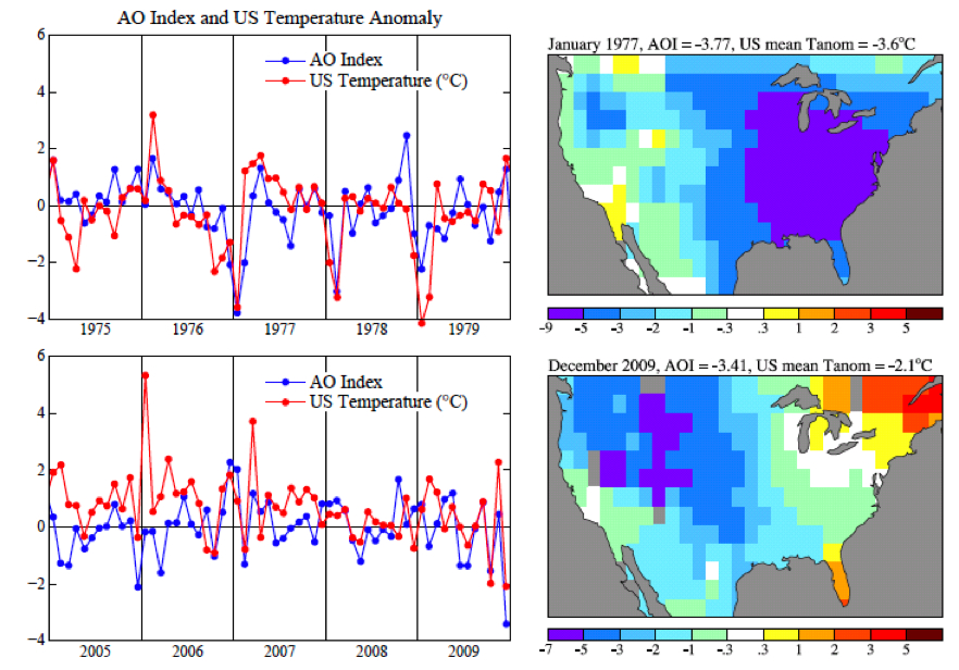
Figure 7. Temperature anomaly from GISS analysis and AO index from NOAA National Weather Service Climate Prediction Center. United States mean refers to the 48 contiguous states.
Figure 7 shows the AO index with greater temporal resolution for two 5‐year periods. It is obvious that there is a high degree of correlation of the AO index with temperature in the United States, with any possible lag between index and temperature anomaly less than the monthly temporal resolution. Large negative anomalies, when they occur, are usually in a winter month. Note that the January 1977 temperature anomaly, mainly located in the Eastern United States, was considerably stronger than the December 2009 anomaly. [There is nothing magic about a 31 day window that coincides with a calendar month, and it could be misleading. It may be more informative to look at a 30‐day running mean and at the Dec‐Jan‐Feb means for the AO index and temperature anomalies.]
The AO index is not so much an explanation for climate anomaly patterns as it is a simple statement of the situation. However, John (Mike) Wallace and colleagues have been able to use the AO description to aid consideration of how the patterns may change as greenhouse gases increase. A number of papers, by Wallace, David Thompson, and others, as well as by Drew Shindell and others at GISS, have pointed out that increasing carbon dioxide causes the stratosphere to cool, in turn causing on average a stronger jet stream and thus a tendency for a more positive Arctic Oscillation. Overall, Figure 6 shows a tendency in the expected sense. The AO is not the only factor that might alter the frequency of Arctic cold air outbreaks. For example, what is the effect of reduced Arctic sea ice on weather patterns? There is not enough empirical evidence since the rapid ice melt of 2007. We conclude only that December 2009 was a highly anomalous month and that its unusual AO can be described as the “cause” of the extreme December weather.
We do not find a basis for expecting frequent repeat occurrences. On the contrary. Figure 6 does show that month‐to‐month fluctuations of the AO are much larger than its long term trend. But temperature change can be caused by greenhouse gases and global warming independent of Arctic Oscillation dynamical effects.
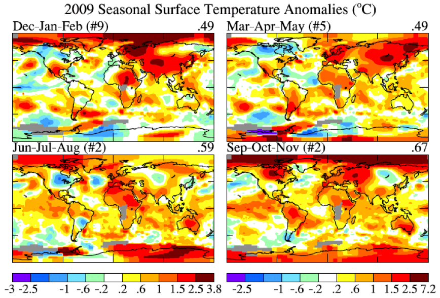
Figure 8. Global maps 4 season temperature anomalies for ~2009. (Note that Dec is December 2008. Base period is 1951‐1980.)
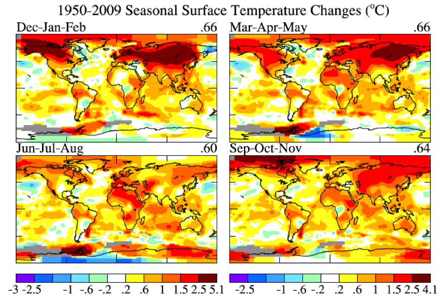
Figure 9. Global maps 4 season temperature anomaly trends for period 1950‐2009.
So let’s look at recent regional temperature anomalies and temperature trends. Figure 8 shows seasonal temperature anomalies for the past year and Figure 9 shows seasonal temperature change since 1950 based on local linear trends. The temperature scales are identical in Figures 8 and 9. The outstanding characteristic in comparing these two figures is that the magnitude of the 60 year change is similar to the magnitude of seasonal anomalies. What this is telling us is that the climate dice are already strongly loaded. The perceptive person who has been around since the 1950s should be able to notice that seasonal mean temperatures are usually greater than they were in the 1950s, although there are still occasional cold seasons.
The magnitude of monthly temperature anomalies is typically 1.5 to 2 times greater than the magnitude of seasonal anomalies. So it is not yet quite so easy to see global warming if one’s figure of merit is monthly mean temperature. And, of course, daily weather fluctuations are much larger than the impact of the global warming trend. The bottom line is this: there is no global cooling trend. For the time being, until humanity brings its greenhouse gas emissions under control, we can expect each decade to be warmer than the preceding one. Weather fluctuations certainly exceed local temperature changes over the past half century. But the perceptive person should be able to see that climate is warming on decadal time scales.
This information needs to be combined with the conclusion that global warming of 1‐2°C has enormous implications for humanity. But that discussion is beyond the scope of this note.
References:
Hansen, J.E., and S. Lebedeff, 1987: Global trends of measured surface air temperature. J. Geophys. Res., 92, 13345‐13372.
Hansen, J., R. Ruedy, J. Glascoe, and Mki. Sato, 1999: GISS analysis of surface temperature change. J. Geophys. Res., 104, 30997‐31022.
Hansen, J.E., R. Ruedy, Mki. Sato, M. Imhoff, W. Lawrence, D. Easterling, T. Peterson, and T. Karl, 2001: A closer look at United States and global surface temperature change. J. Geophys. Res., 106, 23947‐23963.
Hansen, J., Mki. Sato, R. Ruedy, K. Lo, D.W. Lea, and M. Medina‐Elizade, 2006: Global temperature change. Proc. Natl. Acad. Sci., 103, 14288‐14293.
![Reblog this post [with Zemanta]](http://img.zemanta.com/reblog_e.png?x-id=b53d95e1-bbb3-4407-b7f4-7f39150e7b70)