All Posts (522)

Sort by

Steady State Option in SWMM 5

The skip steady state periods uses the last computed flows in the conveyance system instead of computing new flows. In the sample graphs you can see where the change in lateral flow is below 0.05 cfs (the blue arrow in the second image). The network solution used the steady flows about 27 percent of the time. The time step summary in the text output file tells you how often the model was in steady state.

Skip Steady State Periods
Checking this option will make the simulation use the most recently computed conveyance system flows during a steady state period instead of computing a new flow routing solution. A time step is considered to be in steady state if the change in external inflow at each node is below 0.5 cfs and the relative difference between total system inflow and outflow is below 5%.


Read more…

From http://duncan.hull.name/2010/03/17/hunkins-hypothesis/


Cartoonist and engineer Tim Hunkin is probably best known for his exhibits at the Science Museum in London and his Under The Pier Show “a mad arcade of home-made slot machines & simulator rides on Southwold Pier, Suffolk”. His website is a treasure trove of weird and wonderful things.

Tim has an interesting proposition, let’s call in Hunkin’s Hypothesis [1], that technology is what makes us human:

“Technology isn’t just something outside ourselves, it’s an innate part of human nature, like sex, sleeping or eating, and that its been a major driving force in evolution. Tool using, along with language and bipedalism, is essentially what makes us human. The complicated theories used to explain why we first stood up are largely unnecessary. Our hands simply became too useful for holding tools to waste them on walking.”

He bases this idea, on a paper published by Frances Evans [2] about the creative engineering mind. This idea has at least two important implications

  • Engineering is a creative and intellectual process that humans do instinctively, not a dying skill practiced by dinosaurs
  • Engineering is an essential part of education, that needs to be taught more in schools and universities. Tim encourages his grand-children to use spot-welders, glue-guns and soldering irons at every opportunity! Health and safety regulations, plus the fear of being sued make this tricky.

I’m not sure what to make of Hunkin’s Hypothesis yet, but it’s an intriguing idea.

References

  1. Tim Hunkin (2006). Technology is what makes us human. timhunkin.com
  2. Frances Evans (1998). Two legs, thing using and talking: The origins of the creative engineering mind AI & Society, 12 (3), 185-213 DOI:10.1007/BF01206195
  3. Tim Hunkin – The Seaside Inventor, Southwold Pier, Suffolk
Read more…

A new test of the Light:Nutrient hypothesis

ResearchBlogging.orgTo review: I love ecological stoichiometry (ES). I find it a fascinating subject and a useful framework for understanding ecological phenomena. However, ES is still relatively new, with a lot of the empirical work restricted to plankton (esp. Daphnia and algae). So it is always interesting to see theories developed predominantly in the pelagic system examined in other habitats.

One of the more interesting ideas out there is the light:nutrient hypothesis of Urabe and Sterner (1996; the ideas have been expanded in several later papers). Essentially, Urabe and Sterner noted that as you increase the amount of light, you decrease the nutrient content of algae. That's because as the light increases, but the availability of nutrients doesn't, then the algae is able to produce a larger and larger amount of carbon. As the algae become more and more nutrient-poor, the herbivores that graze on these algae get less and less nutrients from their food.

So what happens is a unimodal curve relating growth to the amount of algae present. That's depicted in Figure 1 from Urabe and Sterner (on the left). Part A of this figure shows the growth of algae and the nutrient content of the algae along a gradient of increasing light. As the light goes up, there's more and more algae with less and less phosphorus (and important nutrient). Then in Part B, focus on the line labeled "G, herbivore growth rate". See what it does along that same light gradient? First it increases with light, then it slowly decreases with light.

This kind of response was documented by Urabe and Sterner (1996) and several papers since then, but almost entirely in zooplankton (specifically, Daphnia spp.). However, there are lots of questions about this, primarily revolving around: How often does this occur in natural ecosystems?

This effect depends on a lot of things: The nutrient demands of the algae, the nutrient demands of the consumer, having an appropriate level of nutrients and light, etc. There really isn't much investigation of this effect outside of lakes (most of those studies focused on zooplankton).

A paper just published in Ecology by Hill et al. (2010; full cite below) seeks to investigate whether this occurs for snails growing on periphyton in streams. The authors looked at snail growth in two streams for several years, and primarily looked for evidence of that hypothesized unimodal relationship between light and growth. They did this by measuring the nutrient content of algae, the amount of light, estimating algal productivity, and the amount of growth in snails from month to month.

What's pretty interesting is that they didn't find this effect at all (see figure to the right).

Still, there's good theoretical reason for this effect to be possible, so why wasn't it observed? Well, the authors speculate that the extremely high density of herbivores present cause algal density to be held very low (i.e., competition between snails is so great that food is always in short supply). Recall from the Sterner and Urabe figure above that the mechanism driving this effect is the amount of algal biomass: There's just a lot of food. However, if the food is kept so low that algae can never achieve high biomass production, then food will probably remain limiting despite becoming less nutritious.

The authors did confirm that the algal part of the light nutrient hypothesis was occurring: As light increased (due to changing canopy density), the nutrient content of the algae decreased (less nitrogen and phosphorus). That just didn't translate into less growth in the herbivores.

There were some other things happening in this study that I'd like to know more about. For example, the amount of light was varying with the season, so it was also varying with a lot of other factors, like temperature. Without having thought about it too much, I'm not sure how those other changing conditions might affect different aspects of this system. I'm also not sure I completely buy the explanation that exploitive competition was driving this relationship, but I'll have to think about that some more.

The authors also point to some evidence suggesting that this effect might be widespread for benthic herbivores, although I find that evidence to be weak at this point.

Summary:

The authors of this paper tested the light:nutrient hypothesis in a snail-periphyton system and do not see the predicted relationship between light and herbivore growth rates. The expected unimodal response may be suppressed by heavy competition between grazers.

Hill, W., Smith, J., & Stewart, A. (2010). Light, nutrients, and herbivore growth in oligotrophic streams Ecology, 91 (2), 518-527 DOI: 10.1890/09-0703.1

Urabe, J., & Sterner, RW (1996). Regulation of herbivore growth by the balance of light and nutrients Proceedings of the National Academy of Sciences, 93 (16), 8465-8469 DOI: 10.1073/pnas.93.16.8465
Read more…

Saving U.S. Water and Sewer Systems Would Be Costly

WASHINGTON — One recent morning, George S. Hawkins, a long-haired environmentalist who now leads one of the largest and most prominent water and sewer systems, trudged to a street corner here where water was gushing into the air.

A cold snap had ruptured a major pipe installed the same year the light bulb was invented. Homes near the fashionable Dupont Circle neighborhood were quickly going dry, and Mr. Hawkins, who had recently taken over the District of Columbia Water and Sewer Authority despite having no experience running a major utility, was responsible for fixing the problem.

As city employees searched for underground valves, a growing crowd started asking angry questions. Pipes were breaking across town, and fire hydrants weren’t working, they complained. Why couldn’t the city deliver water, one man yelled at Mr. Hawkins.

Such questions are becoming common across the nation as water and sewer systems break down. Today, a significant water line bursts on average every two minutes somewhere in the country, according to a New York Times analysis of Environmental Protection Agency data.

In Washington alone there is a pipe break every day, on average, and this weekend’s intense rains overwhelmed the city’s system, causing untreated sewage to flow into the Potomac and Anacostia Rivers.

State and federal studies indicate that thousands of water and sewer systems may be too old to function properly.

For decades, these systems — some built around the time of the Civil War — have been ignored by politicians and residents accustomed to paying almost nothing for water delivery and sewage removal. And so each year, hundreds of thousands of ruptures damage streets and homes and cause dangerous pollutants to seep into drinking water supplies.

Mr. Hawkins’s answer to such problems will not please a lot of citizens. Like many of his counterparts in cities like Detroit, Cincinnati, Atlanta and elsewhere, his job is partly to persuade the public to accept higher water rates, so that the utility can replace more antiquated pipes.

“People pay more for their cellphones and cable television than for water,” said Mr. Hawkins, who before taking over Washington’s water system ran environmental groups and attended Princeton andHarvard, where he never thought he would end up running a sewer system.

“You can go a day without a phone or TV,” he added. “You can’t go a day without water.”

But in many cities, residents have protested loudly when asked to pay more for water and sewer services. In Los Angeles, Indianapolis, Sacramento — and before Mr. Hawkins arrived, Washington — proposed rate increases have been scaled back or canceled after virulent ratepayer dissent.

So when Mr. Hawkins confronted the upset crowd near Dupont Circle, he sensed an opportunity to explain why things needed to change. It was a snowy day, and while water from the broken pipe mixed with slush, he began cheerily explaining that the rupture was a symptom of a nationwide disease, according to people present.

Mr. Hawkins — who at 49 has the bubbling energy of a toddler and the physique of an aging professor — told the crowd that the average age of the city’s water pipes was 76, nearly four times that of the oldest city bus. With a smile, he described how old pipes have spilled untreated sewage into rivers near homes.

“I don’t care why these pipes aren’t working!” one of the residents yelled. “I pay $60 a month for water! I just want my toilet to flush! Why do I need to know how it works?”

Mr. Hawkins smiled, quit the lecture, and retreated back to watching his crew.

On Capitol Hill, the plight of Mr. Hawkins and other utility managers has become a hot topic. In the last year, federal lawmakers have allocated more than $10 billion for water infrastructure programs, one of the largest such commitments in history.

But Mr. Hawkins and others say that even those outlays are almost insignificant compared with the problems they are supposed to fix. An E.P.A. study last year estimated that $335 billion would be needed simply to maintain the nation’s tap water systems in coming decades. In states like New York, officials estimate that $36 billion is needed in the next 20 years just for municipal wastewater systems.

As these discussions unfold, particular attention is being paid to Mr. Hawkins. Washington’s water and sewer system serves the White House, many members of Congress, and two million other residents, and so it surprised some when Mr. Hawkins was hired to head the agency last September, since he did not have an engineering background or the résumé of a utility chief.

In fact, after he had graduated from Harvard Law School in 1987, he spent a few years helping companies apply for permits to pollute rivers and lakes. (At night — without his firm’s knowledge — he had a second career as a professional break dancer. He met his wife, a nurse, when he fell off a platform at a dance club and landed on his head.)

But he quickly became disenchanted with corporate law. He moved to the E.P.A., where he fought polluters, and then the White House, and eventually relocated his family to a farm in New Jersey where they shoveled the manure of 35 sheep and kept watch over 175 chickens, and Mr. Hawkins began running a series of environmental groups.

The mayor of Washington, Adrian M. Fenty, asked Mr. Hawkins to move to the city in 2007 to lead the Department of the Environment. He quickly became a prominent figure, admired for his ability to communicate with residents and lawmakers. When the Water and Sewer Authority needed a new leader, board members wanted someone familiar with public relations campaigns. Mr. Hawkins’s mandate was to persuade residents to pay for updating the city’s antiquated pipes.

At a meeting with board members last month, Mr. Hawkins pitched his radical solution. Clad in an agency uniform — his name on the breast and creases indicating it had been recently unfolded for the first time — Mr. Hawkins suggested raising water rates for the average resident by almost 17 percent, to about $60 a month per household. Over the coming six years, that rate would rise above $100.

With that additional money, Mr. Hawkins argued, the city could replace all of its pipes in 100 years. The previous budget would have replaced them in three centuries.

The board questioned him for hours. Others have attacked him for playing on false fears.

“This rate hike is outrageous,” said Jim Graham, a member of the city council. “Subway systems need repairs, and so do roads, but you don’t see fares or tolls skyrocketing. Providing inexpensive, reliable water is a fundamental obligation of government. If they can’t do that, they need to reform themselves, instead of just charging more.”

Similar battles have occurred around the nation. In Philadelphia, officials are set to start collecting $1.6 billion for programs to prevent rain water from overwhelming the sewer system, amid loud complaints. Communities surrounding Cleveland threatened to sue when the regional utility proposed charging homeowners for the water pollution running off their property. In central Florida, a $1.8 billion proposal to build a network of drinking water pipes has drawn organized protests.

“We’re relying on water systems built by our great-grandparents, and no one wants to pay for the decades we’ve spent ignoring them,” said Jeffrey K. Griffiths, a professor at Tufts University and a member of the E.P.A.’s National Drinking Water Advisory Council.

“There’s a lot of evidence that people are getting sick,” he added. “But because everything is out of sight, no one really understands how bad things have become.”

To bring those lapses into the light, Mr. Hawkins has become a cheerleader for rate increases. He has begun a media assault highlighting the city’s water woes. He has created a blog and a Facebook page that explain why pipes break. He regularly appears on newscasts and radio shows, and has filled a personal Web site with video clips of his appearances.

It’s an all-consuming job. Mr. Hawkins tries to show up at every major pipe break, no matter the hour. He often works late into the night, and for three years he has not lived with his wife and two teenage children, who remained in New Jersey.

“The kids really miss their father,” said his wife, Tamara. “When we take him to the train station after a visit, my daughter in particular will sometimes cry. He’s missing out on his kids’ childhoods.”

And even if Mr. Hawkins succeeds, the public might not realize it, or particularly care. Last month, the utility’s board approved Mr. Hawkins’s budget and started the process for raising rates. But even if the bigger budget reduces the frequency of water pipe breaks by half — a major accomplishment — many residents probably won’t notice. People tend to pay attention to water and sewer systems only when things go wrong.

“But this is a once-in-a-lifetime opportunity,” Mr. Hawkins said recently, in between a meeting with local environmentalists and rushing home to do paperwork in his small, spartan apartment, near a place where he was once mugged at gunpoint.

“This is the fight of our lifetimes,” he added. “Water is tied into everything we should care about. Someday, people are going to talk about our sewers with a real sense of pride.”

From the NYT


Reblog this post [with Zemanta]
Read more…

Lead and Lag Pump Options in SWMM 5

Introduction: If you have a lead and lag pump connecting the same upstream and downstream nodes the normal behavior for the two pumps is to have the the lead pump turn on first followed by the lag pump. The turn on and turn off depths for the pumps determine when the pumps turn of. The pump will work as a simple lead and lag pump based on a wet well elevation without any real time controls.


If you want to add real time controls (RTC) to the lead and lag pumps you can add more sophisticated controls. For example, if you wanted to turn on and off the lead pump at successive time steps then you can add these RTC rules


; New Real Time Control (RTC) Rules

RULE RULE-1

IF PUMP LEAD_PUMP STATUS = ON

AND PUMP LAG_PUMP STATUS = ON

THEN PUMP LEAD_PUMP STATUS = OFF

PRIORITY 1.000000


RULE RULE-2

IF PUMP LEAD_PUMP STATUS = OFF

AND PUMP LAG_PUMP STATUS = ON

THEN PUMP LEAD_PUMP STATUS = ON

PRIORITY 1.000000


RULE RULE-3

IF PUMP LEAD_PUMP STATUS = OFF

AND PUMP LAG_PUMP STATUS = ON

THEN PUMP LEAD_PUMP STATUS = ON

PRIORITY 1.000000


If you want to add a pattern of 2 time steps and 1 time step off for both pumps then you can add this RTC new rule to control the lag pump:

RULE RULE-4
IF PUMP LEAD_PUMP STATUS = OFF
AND PUMP LAG_PUMP STATUS = ON
THEN PUMP LAG_PUMP STATUS = OFF
PRIORITY 1.000000

Reblog this post [with Zemanta]
Read more…

Tropics: Global Warming Likely to Significantly Affect Rainfall Patterns

ScienceDaily (Feb. 28, 2010) — Climate models project that the global average temperature will rise about 1°C by the middle of the century, if we continue with business as usual and emit greenhouse gases as we have been. The global average, though, does not tell us anything about what will happen to regional climates, for example rainfall in the western United States or in paradisical islands like Hawai'i.

Analyzing global model warming projections in models used by the Intergovernmental Panel on Climate Change, a team of scientists headed by meteorologist Shang-Ping Xie at the University of Hawaii at Mānoa's International Pacific Research Center, finds that ocean temperature patterns in the tropics and subtropics will change in ways that will lead to significant changes in rainfall patterns. The study will be published in the Journal of Climate this month, breaking ground on such regional climate forecasts.

Scientists have mostly assumed that the surfaces of Earth's oceans will warm rather evenly in the tropics. This assumption has led to "wetter-gets-wetter" and "drier-gets-drier" regional rainfall projections. Xie's team has gathered evidence that, although ocean surface temperatures can be expected to increase mostly everywhere by the middle of the century, the increase may differ by up to 1.5°C depending upon the region.

"Compared to the mean projected rise of 1°C, such differences are fairly large and can have a pronounced impact on tropical and subtropical climate by altering atmospheric heating patterns and therefore rainfall," explains Xie. "Our results broadly indicate that regions of peak sea surface temperature will get wetter, and those relatively cool will get drier."

Two patterns stand out. First, the maximum temperature rise in the Pacific is along a broad band at the equator. Already today the equatorial Pacific sets the rhythm of a global climate oscillation as shown by the world-wide impact of El Niño. This broad band of peak temperature on the equator changes the atmospheric heating in the models. By anchoring a rainband similar to that during an El Nino, it influences climate around the world through atmospheric teleconnections.

A second ocean warming pattern with major impact on rainfall noted by Xie and his colleagues occurs in the Indian Ocean and would affect the lives of billions of people. Overlayed on Indian Ocean warming for part of the year is what scientists call the Indian Ocean Dipole that occasionally occurs today once every decade or so. Thus, the models show that warming in the western Indian Ocean is amplified, reaching 1.5°C, while the eastern Indian Ocean it is dampened to around 0.5°C.

"Should this pattern come about," Xie predicts, "it can be expected to dramatically shift rainfall over eastern Africa, India, and Southeast Asia. Droughts could then beset Indonesia and Australia, whereas regions of India and regions of Africa bordering the Arabian Sea could get more rain than today."

Patterns of sea surface temperature warming and precipitation change in 2050 as compared with 2000. Annual mean precipitation change is shown in green/gray shade and white contours in mm/month. Precipitation tends to increase over regions with ocean warming above the tropical mean (contours of warm colors in oC), and to decrease where ocean warming is below the tropical mean (contours of cool colors).


University of Hawaii at Manoa (2010, February 28). Tropics: Global warming likely to significantly affect rainfall patterns.ScienceDaily. Retrieved March 3, 2010, from http://www.sciencedaily.com/releases/2010/02/100226093238.htm

Read more…
MWH Soft Announces InfoSWMM 2D: Next Generation of Two-Dimensional
Hydrodynamic Stormwater and Overland Flow Modeling


Revolutionary New Product Equips Engineers with Unmatched Power to Predict the Extent and Duration of
Urban and Rural Flooding for Comprehensive Stormwater Management

Broomfield, Colorado USA, March 3, 2010 — MWH Soft, a leading global innovator of wet infrastructure modeling and simulation software and technologies, today announced the second quarter 2010 release ofInfoSWMM 2D. The breakthrough application will allow engineers to accurately model two-dimensional (2D) above-ground urban and rural flooding combined with the power of one-dimensional (1D) hydraulic and water quality sewer systems analysis — all directly within the powerful ESRI’s (Redlands, CA) ArcGIS environment. It provides a single geospatial environment for building and analyzing comprehensive 2D models that simulate urban stormwater, sanitary sewers, river flooding and pollutant transport. The new product demonstrates MWH Soft’s ongoing commitment to delivering pioneering technology that raises the bar for urban drainage network modeling and simulation, helping to shape the future of this critical sector.

A fully hydrodynamic geospatial stormwater modeling and management software application, InfoSWMM 2D can be used to model the entire land phase of the hydrologic cycle as applied to urban stormwater systems. The model can perform single event or long-term (continuous) rainfall-runoff simulations accounting for climate, soil, land use, and topographic conditions of the watershed. In addition to simulating runoff quantity, InfoSWMM 2Dcan reliably predict runoff quality, including buildup and washoff of pollutants from primarily urban watersheds. It also features very sophisticated Real-Time Control (RTC) schemes for the operational control and management of hydraulic structures.

Built atop ArcGIS and using exceptionally robust and efficient numerical simulation capabilities, InfoSWMM 2Dseamlessly integrates advanced functionality for modeling the most complex storm and combined sewer collection systems and surface flooding with incredible ease and accuracy. It delivers the power of 2D hydrodynamic simulation, which provides significant advantages over 1D simulation when modeling flows through complex urban geometries or open ground, where the source and direction of flow are difficult to assume. When overland flows are routed through a complex urban area or very varied terrain, the numerous elevation changes and obstacles can significantly impact results. This problem can be further complicated by the presence of sewer networks, in which flows can both enter and exit the system during flood events.

Modeling such complex flow scenarios accurately and efficiently requires a model with both 1D and 2D simulation capabilities. 1D simulation is used to identify location of flooding and 2D simulation to investigate direction and depth of flood flows in specific areas. The full 2D free-surface shallow water equations are solved using a highly advanced finite volume method, which is particularly suitable for rapidly varying flood flows such as those through steep streets and road junctions and those associated with bank overtopping or breaching. With unparalleled 1D/2D dynamic linking capabilities, InfoSWMM 2D gives engineers the unprecedented power to analyze and predict potential flood extents, depth and velocity and accurately model the interaction of surface and underground systems in an integrated 1D/2D environment. It can also be effectively used to simulate and analyze tidal surges, dam breaks and breaches on sewer networks. To achieve even greater model accuracy and flexibility, users will also be able to utilize multiple surface mesh designs and display water levels and velocities throughout the flooded areas.

InfoSWMM 2D raises the bar for ArcGIS-based stormwater modeling and managing the risks of flooding, and marks a new direction in advanced sewer collection systems simulation and analysis,” said Paul F. Boulos, Ph.D., Hon.D.WRE, F.ASCE, President and COO of MWH Soft. “Our rapid pace of innovation continues to benefit engineers across the globe and drive increased efficiency and quality of wet infrastructure management, design, and renewal. InfoSWMM 2D is the ultimate tool to accurately assess the impacts of urban and rural flooding, then formulate and evaluate sound and cost-effective mitigation strategies. We are inspired and proud to play this important role in helping to build a better world for everyone.”

About MWH Soft
MWH Soft is a leading global provider of wet infrastructure modeling and simulation software and professional solutions designed to meet the technological needs of water/wastewater utilities, government industries, and engineering organizations worldwide. Its clients include the majority of the largest North American cities, foremost utilities on all five continents, and ENR top-rated design firms. With unparalleled expertise and offices in North America, Europe, and Asia Pacific, the MWH Soft connected portfolio of best-in-class product lines empower thousands of engineers to competitively plan, manage, design, protect, operate and sustain highly efficient and reliable infrastructure systems, and provide an enduring platform for customer success. For more information, call MWH Soft at +1 626-568-6868, or visit www.mwhsoft.com.

Read more…

SWMM 5 Iterations

These three graphs show how the number of iterations to solve the St. Venant equation in SWMM 5 changes during the course of the simulation based on rapidly changing inflow, steady inflow and decreasing inflow. This example allows up to ten iterations and a tighter head tolerance to better illustrate how the number of iterations increase at the beginning of the simulation and during rapid inflow. Normally, in SWMM 5 the number of iterations will be between a minimum of 2 and a maximum of 4 iterations.

In the first graph the outflow is in blue and the number of iterations at each time step is shown in red. In the second graph the bubble size is based on the number of iterations and the y axis is outflow of the network. The third graph shows the number of iterations used at each link in the model at a particular time step. The more the flow changes the more iterations are needed to keep the flow in balance.


Reblog this post [with Zemanta]
Read more…

SWMM5 Bubble Plot of Continuity Error

The overall continuity error at any time during the simulation is simply the total inflow minus the total outflow. The total inflow is the dry weather, wet weather, groundwater, I&I inflow, external inflow and the initial network storage. The total outflow is the amount of surface flooding, outfall flow, reacted flow and the final storage.

The continuity error = Total Inflow - Total Outflow

The continuity error can be variable over time as this graph of the total inflow, total outflow and continuity error over time shows for the classic extran example from SWMM 3 and SWMM 4. The continuity error can be negative or positive at each saved time step and it tends to balance out over time. As you can imagine depending on how long the simulation lasts the continuity error may be much greater than zero. If you can the simulation to dry weather flow is reached in the sanitary network or the stormwater network has drained the continuity error will be better.


If we look at a bubble chart of the continuity error over time (with the bubble size the continuity error) and the y axis the Total Inflow to the network you can see how continuity error increases and then decreases over time. The white bubbles are negative continuity error points.


Read more…

Stimulus-funded weirs completed in Lehigh Acres


DON RUANE • DRUANE@NEWS-PRESS.COM • FEBRUARY 25, 2010

1:16 P.M. — The first completed stimulus -funded projects in Florida were celebrated in Lehigh Acres this morning.

Officials and guest of the East County Water Control District cut ribbons on two new weirs that will help store water to improve its quality and the district’s ability to control water level in the Orange River and prevent flooding.

“This is the first project funded in Florida by federal stimulus dollars,” district board chairman Neal Horrom told about 40 people gathered at Harns Marsh, a 578-acre water retention area that drains into the Orange River.

The $1.97 million Harns Marsh project included $1.45 million in stimulus loan money funneled through the state Department of Environmental Protect. The district will pay back the loan.

Read more…

MWH Soft President Dr. Paul F. Boulos Inducted Into
University of Kentucky College of Engineering Hall of Distinction


Broomfield, Colorado USA, February 17, 2010 — MWH Soft, a leading global innovator of wet infrastructure modeling and simulation software and technologies, today announced that its president and chief operating officer, Dr. Paul F. Boulos, Hon.D.WRE, F.ASCE, has been selected for induction into the University of Kentucky College of Engineering Hall of Distinction for 2010.

This great honor recognizes Dr. Boulos’s “distinguished service to the profession, outstanding character, and commitment to community service,” noted Dr. Thomas W. Lester, Dean of the College of Engineering.

The Hall of Distinction was established in 1991 to recognize alumni whose distinguished careers have brought honor to the University and the College of Engineering. Although many are nominated annually, only 87 alumni have been named to the hall since its inception. Induction is the most prestigious honor given by the university to its alumni. Dr. Boulos will receive the award at a ceremony and dinner on April 23, 2010, at the University of Kentucky campus in Lexington.

Dr. Boulos is one of the world’s foremost experts on water resources engineering and a leading global authority on drinking water distribution engineering, from hydraulics to water quality principles. He has published prolifically, co-authoring nine authoritative books, and more than 100 scientific publications carry his name.

Acclaimed for his practical and scientific expertise and his extensive experience in both academe and the corporate world, Dr. Boulos has been a featured speaker at leading organizations in science, entrepreneurship and philanthropy. A Fellow of the American Society of Civil Engineers (ASCE), he has been honored by an impressive array of national and international scientific and engineering societies, government and research organizations and NGOs. Among these recognitions are technical awards for excellence in scholarship from the American Society of Civil Engineers, the American Water Works Association and the U.S. Environmental Protection Agency.

In 2008, he became the youngest person — and one of only sixteen worldwide — to be awarded Honorary Diplomate status (Hon.D.WRE) by the American Academy of Water Resources Engineers. The designation, the academy’s highest honor, acknowledges eminence in the field of water resources engineering. In the same year, he was also awarded the prominent Ray R. Irani Pride of Heritage Award from the Lebanese American Foundation, and received Special U.S. Congressional Recognition for his outstanding and invaluable service to the community. In 2009, Dr. Boulos received one of America’s most prestigious awards, the Ellis Island Medal of Honor, for his outstanding contributions to our communities, our nation and the world.

Dr. Boulos received his Doctorate, Master of Science, and Bachelor of Science degrees in Civil Engineering from the University of Kentucky (Lexington) and a Bachelor of Science degree in General Science from the Lebanese American University (Beirut, Lebanon), which honored him as its 2008 Alumnus of the Year. He also completed the Advanced Management Program at Harvard Business School.

About MWH Soft
MWH Soft is a leading global provider of wet infrastructure modeling and simulation software and professional solutions designed to meet the technological needs of water/wastewater utilities, government industries, and engineering organizations worldwide. Its clients include the majority of the largest North American cities, foremost utilities on all five continents, and ENR top-rated design firms. With unparalleled expertise and offices in North America, Europe, and Asia Pacific, MWH Soft connected portfolio of best-in-class product lines empower thousands of engineers to competitively plan, manage, design, protect, operate and sustain highly efficient and reliable infrastructure systems, and provide an enduring platform for customer success. For more information, call MWH Soft at +1 626-568-6868, or visit www.mwhsoft.com.

Read more…

The Story of P(ee)

The important element Phosphorus which we overuse and waste in our treatment processes.


http://www.miller-mccune.com/science-environment/the-story-of-pee-8736/


The Story of P(ee)

In which phosphorus, a substance present in every living cell, is being used up and flushed away.

  • SHARE:

  • digg
  • delicious
  • newsvine
  • google
  • reddit
  • facebook
  • yahoo
  • mixx
  • fark
  • stumbleupon
feature photo

New research warns that phosphorus production could peak in two decades. Without phosphorus, the world cannot grow food ... or make periodic table cupcakes. (Chemical Heritage Foundation/flickr.com)

P is for phosphorus, the stuff of life, and “p” is for “peak phosphorus” by 2030, ecologists say, unless — presto! — pee can be turned into gold through modern-day alchemy.

Unremarked and unregulated by the United Nations and other high-level assemblies, the world’s supply of phosphate rock, the dominant source of phosphorus for fertilizer, is being rapidly — and wastefully — drawn down. By most estimates, the best deposits will be gone in 50 to 100 years.

Worse, phosphorus production could peak in just two decades, according to new research from Australia and Sweden. That’s when demand could outstrip supply, playing out a familiar scenario of scarcity, price shocks, riots, starvation and war.

In short, peak phosphorus could be the unwelcome sequel to peak oil.

“It’s an emerging crisis,” said Stuart White, director of the Institute for Sustainable Futures at the University of Technology in Sydney, Australia, and a co-author of two phosphorus studies published recently by Global Environmental Change and the International Conference on Nutrient Recovery from Wastewater Streams.

“Right now, you can get phosphorus if you’re willing to pay for it,” White said. “But global reserves will peak in 20 to 25 years. Africa has not stirred in terms of its phosphorus use. Africa could take off, and that’s very scary.

“We will continue to mine phosphorus. It’s just that if we want to extend the longevity of the resource, we’ll have to reduce extraction rates significantly and put in much bigger recycling.”

P in DNA
Peak phosphorus, as White and his colleagues describe it, based on data from the U.S. Geological Survey and the fertilizer industry, makes peak oil look like a cakewalk.

Both oil and phosphate rock are finite, non-renewable fossil resources that were created in deep geological time, whether from decaying biomass for oil or millennia of pooping seabirdsfor phosphate. But there are substitutes for oil; there is no substitute for phosphorus, an element that forms bones, sustains cell membranes and gives shape to the DNA and RNA in all living things.

“We are effectively addicted to phosphate rock,” said Dana Cordell, a Ph.D. candidate who works with White and co-authored the recent studies. Cordell’s thesis, The Story of Phosphorus: Sustainable Implications of Global Phosphorus Scarcity for Food Security, was published as an e-book by Linköping University in Sweden on Feb. 4.

“The quality of the remaining phosphate rock is declining,” Cordell said. “We’re going to have to shift away from our use of it. There is no single quick fix solution.”

Worldwide, according to Cordell and White, five times more phosphorus is being mined than is being consumed. Stated another way, 15 million tons of phosphorus is mined yearly to grow food, but 80 percent never reaches the dinner table: It is lost to inefficiency and waste.

Farmers use too much fertilizer and it runs off the land, polluting streams, lakes and oceans. Industrial agriculture does not plow crop residues back into the soil after the harvest. In some countries, consumers throw away a third of their food, even when much of it is still edible.

Mature animals, including humans, excrete nearly 100 percent of the phosphorus they consume. But only half of animal manure — the largest organic and renewable source of phosphorus — is being recycled back onto farmland worldwide, studies show. And only 10 percent of what humans excrete is returned to agriculture as sludge or wastewater.

“We need to start talking about our pee and poo more seriously,” Cordell said. “We need to be thinking in terms of 50 to 100 years.”

In 2008, as the price of phosphorus skyrocketed from $50 to $400 per ton, Cordell, White and other scientists in Australia, Sweden, Canada and the Netherlands formed the Global Phosphorus Research Initiative. The group hopes to capture the attention of the U.N. by holding an international workshop Feb. 25 and 26 in Linköping.

“Phosphorus is an issue without a home,” White said. “It falls in the cracks between nations.”

The ABC’s of P
Here’s President Franklin D. Roosevelt, addressing the Congress in 1938:

I cannot over-emphasize the importance of phosphorus not only to agriculture and soil conservation but also to the physical health and economic security of the people of the nation.

Without phosphorus, the world cannot grow food. Yet only three countries control 73 percent of the world’s remaining known reserves of phosphate rock. By contrast, the 13 members of the Organization of the Petroleum Exporting Countries control 75 percent of known oil reserves.

The U.S. now has only a 25-year supply left of phosphate rock, most of it is in Florida and North Carolina, studies show. China has the largest reserves — 27 percent of the total — but has clamped down on exports with a steep tariff. Morocco is occupying the Western Sahara and its reserves and is exporting them to the U.S, even as the U.N. condemns the trade.

Africa is now both the largest exporter of phosphate rock and the continent with the worst food shortages.

“We’re calling this the biggest problem no one’s heard of,” said James Elser, an Arizona State University ecologist who recently co-founded the Sustainable Phosphorus Initiative, a new research group on campus. (Arizona State will send representatives to the conference in Sweden this month, and next year, the university plans to host the second international summit on phosphorus.)

“The scope and urgency of the time scale need to be narrowed down,” Elser said. “I don’t think we have a really good consensus about the peak. Is this really an acute problem in 30 years? If this is true, then the human consequences are much more acute than anything we’ve seen with climate change, in terms of hunger. Food is food. We can’t live without it.”

By some estimates, peak phosphorus is already past. In a 2007 paper in Energy Bulletin, Canadian physicist Patrick Déry and co-author Bart Anderson hypothesized that global reserves of phosphate rock peaked in 1989.

“Phosphorus may be the real bottleneck of agriculture,” they said, echoing a phrase from Isaac Asimov, a biochemist as well as science fiction writer, who called it “life’s bottleneck.”

White and Cordell dispute the 1989 date for peak phosphorus, saying that an apparent production decline in phosphorus after that year was only temporary: It was caused by the breakup of the Soviet Union and the saturation of fertilizer in European soils. In any case, they say, whenever the peak, the cost of production is indisputably going up and the quality of phosphate rock is declining.

“It’s generally true that the data is very poor on the reserves,” White said. “All it goes to show is that we can’t really know definitely. But the principle remains.”

P and the 3 R’s
In Dune, his 1965 sci-fi classic, Frank Herbert imagines a futuristic empire at war over spice, a life-extending drug that is mined for interstellar travel. Spice is the most essential and most valuable commodity in the universe, and Dune chronicles the struggle for the desert planet Arrakis, the only place where spice is found.

Unfortunately, peak phosphorus is not science fiction.

Mark Edwards, a food marketing expert at Arizona State, believes that water and phosphorus are the two most critical problems for world food supply. Last year, in the course of writing a book on the crisis in world agriculture, titled, Crash! The Demise of Fossil Food and the Rise of Abundance, Edwards said he “did the math” and realized that phosphorus was running out.

Crash! contains a doomsday scenario for a “resource run” on phosphorus, complete with rumor, speculation, hoarding, guarded mines, restricted exports, high prices, bankrupt farmers and a hysterical press.

Edwards co-founded the Arizona State phosphorus initiative because, he said, “I wanted to verify that my math was correct. I was hoping it was wrong. I want to help farmers recover their waste nutrients.

“Phosphorus is way under the radar for everybody. Most scientists just aren’t aware of it.”

Phosphorus cannot be manufactured or synthesized in a lab. The only way to avert a supply crisis, researchers say, is to adopt the “3 R’s” of sustainability: “Reduce, Reuse and Recycle.”

For starters, they say, reducing demand means bucking a global trend and deliberately choosing to eat less meat. Meat- and dairy-based diets require up to three times as much phosphorus as vegetarian diets.

If the Western world switched en masse to a vegetarian diet, it could lower the world demand for phosphorus in fertilizers by as much as 45 percent, the studies show. If, on the other hand, Indians switched to a meat-based diet, it would triple India’s demand for phosphorus.

“It goes to the heart of what people see as affluence,” White said. “Can we afford to have 9 billion people in 2050 eating as high on the food chain as Americans and Australians do? The answer, clearly, is no. As Gandhi said, ‘There’s enough for everyone’s need but not for everyone’s greed.’

“It’s not for me to tell other people what they should eat. But people in Western industrial countries have a choice. There is no need to eat meat.”

Reuse and recycling are possible because, unlike oil, phosphorus can be recovered after it is used. For thousands of years, farmers did just that, plowing manure and human “night soil” back onto the land. In modern-day agriculture, however, animal feed lots are often thousands of miles away from the fields, and toilets flush away human waste.

Phosphorus cannot be destroyed, but it is becoming dissipated in the environment, Elser said. What’s lost today to rivers and oceans will take another 10 to 15 million years to become phosphate rock on dry land, as happened on now depleted “phosphate islands” like the down-on-its-luck nation of Nauru.

“There’s a whole industry that needs to be invented to capture phosphorus,” Elser said. “We need a new way of growing crops that keeps it in the field instead of letting it run down into the Gulf of Mexico. We need plants that are more efficient at getting phosphorus.

“We’re calling it ‘closing the human-phosphorus cycle.’”

Ideally, researchers say, cities will become phosphorus “hotspots” of urine and feces that can fertilize the surrounding farmland. Sweden for example, plans to recycle 60 percent of its phosphorus back into agriculture by 2015. Two Swedish cities presently require all new toilets to separate urine for use on local farms. The nutrients in one person’s urine are believed to be sufficient to produce at least half and potentially all the food requirements for another person.

Using collected human waste as a source of otherwise hard to obtain chemicals like phosphorus dates back at least to Nero’s “urine tax,” while alchemists in Europe routinely decanted urine to refine elemental phosphorus for their experiments.

Society’s prevailing view of wastewater as a pollutant and not a resource has been called “urine blindness.” Victor Hugo, the French novelist, saw it coming, various phosphorus studies have recalled. As he wrote in Les Miserables not long after the introduction of flush toilets in the mid 19th century:

Thanks to human dung, the earth in China is still as young as in the days of Abraham. Chinese wheat yields a hundredfold of the seed. There is no guano comparable in fertility with the detritus of a capital. A great city is the most mighty of dung-makers. Certain success would attend the experiment of employing the city to manure the plain. If our gold is manure, our manure, on the other hand, is gold.


Reblog this post [with Zemanta]
Read more…

2009 temperatures by Jim Hansen

2009 temperatures by Jim Hansen

Filed under: — group @ 17 January 2010

This is Hansen et al’s end of year summary for 2009 (with a couple of minor edits). Update: A final version of this text is available here.

If It’s That Warm, How Come It’s So Damned Cold?


by James Hansen, Reto Ruedy, Makiko Sato, and Ken Lo

The past year, 2009, tied as the second warmest year in the 130 years of global instrumental temperature records, in the surface temperature analysis of the NASA Goddard Institute for Space Studies (GISS). The Southern Hemisphere set a record as the warmest year for that half of the world. Global mean temperature, as shown in Figure 1a, was 0.57°C (1.0°F) warmer than climatology (the 1951-1980 base period). Southern Hemisphere mean temperature, as shown in Figure 1b, was 0.49°C (0.88°F) warmer than in the period of climatology.


Figure 1. (a) GISS analysis of global surface temperature change. Green vertical bar is estimated 95 percent confidence range (two standard deviations) for annual temperature change. (b) Hemispheric temperature change in GISS analysis. (Base period is 1951-1980. This base period is fixed consistently in GISS temperature analysis papers – see References. Base period 1961-1990 is used for comparison with published HadCRUT analyses in Figures 3 and 4.)

The global record warm year, in the period of near-global instrumental measurements (since the late 1800s), was 2005. Sometimes it is asserted that 1998 was the warmest year. The origin of this confusion is discussed below. There is a high degree of interannual (year‐to‐year) and decadal variability in both global and hemispheric temperatures. Underlying this variability, however, is a long‐term warming trend that has become strong and persistent over the past three decades. The long‐term trends are more apparent when temperature is averaged over several years. The 60‐month (5‐year) and 132 month (11‐year) running mean temperatures are shown in Figure 2 for the globe and the hemispheres. The 5‐year mean is sufficient to reduce the effect of the El Niño – La Niña cycles of tropical climate. The 11‐year mean minimizes the effect of solar variability – the brightness of the sun varies by a measurable amount over the sunspot cycle, which is typically of 10‐12 year duration.


Figure 2. 60‐month (5‐year) and 132 month (11‐year) running mean temperatures in the GISS analysis of (a) global and (b) hemispheric surface temperature change. (Base period is 1951‐1980.)

There is a contradiction between the observed continued warming trend and popular perceptions about climate trends. Frequent statements include: “There has been global cooling over the past decade.” “Global warming stopped in 1998.” “1998 is the warmest year in the record.” Such statements have been repeated so often that most of the public seems to accept them as being true. However, based on our data, such statements are not correct. The origin of this contradiction probably lies in part in differences between the GISS and HadCRUT temperature analyses (HadCRUT is the joint Hadley Centre/University of East Anglia Climatic Research Unit temperature analysis). Indeed, HadCRUT finds 1998 to be the warmest year in their record. In addition, popular belief that the world is cooling is reinforced by cold weather anomalies in the United States in the summer of 2009 and cold anomalies in much of the Northern Hemisphere in December 2009. Here we first show the main reason for the difference between the GISS and HadCRUT analyses. Then we examine the 2009 regional temperature anomalies in the context of global temperatures.


Figure 3. Temperature anomalies in 1998 (left column) and 2005 (right column). Top row is GISS analysis, middle row is HadCRUT analysis, and bottom row is the GISS analysis masked to the same area and resolution as the HadCRUT analysis. [Base period is 1961‐1990.]

Figure 3 shows maps of GISS and HadCRUT 1998 and 2005 temperature anomalies relative to base period 1961‐1990 (the base period used by HadCRUT). The temperature anomalies are at a 5 degree‐by‐5 degree resolution for the GISS data to match that in the HadCRUT analysis. In the lower two maps we display the GISS data masked to the same area and resolution as the HadCRUT analysis. The “masked” GISS data let us quantify the extent to which the difference between the GISS and HadCRUT analyses is due to the data interpolation and extrapolation that occurs in the GISS analysis. The GISS analysis assigns a temperature anomaly to many gridboxes that do not contain measurement data, specifically all gridboxes located within 1200 km of one or more stations that do have defined temperature anomalies.

The rationale for this aspect of the GISS analysis is based on the fact that temperature anomaly patterns tend to be large scale. For example, if it is an unusually cold winter in New York, it is probably unusually cold in Philadelphia too. This fact suggests that it may be better to assign a temperature anomaly based on the nearest stations for a gridbox that contains no observing stations, rather than excluding that gridbox from the global analysis. Tests of this assumption are described in our papers referenced below.


Figure 4. Global surface temperature anomalies relative to 1961‐1990 base period for three cases: HadCRUT, GISS, and GISS anomalies limited to the HadCRUT area. [To obtain consistent time series for the HadCRUT and GISS global means, monthly results were averaged over regions with defined temperature anomalies within four latitude zones (90N‐25N, 25N‐Equator, Equator‐25S, 25S‐90S); the global average then weights these zones by the true area of the full zones, and the annual means are based on those monthly global means.]

Figure 4 shows time series of global temperature for the GISS and HadCRUT analyses, as well as for the GISS analysis masked to the HadCRUT data region. This figure reveals that the differences that have developed between the GISS and HadCRUT global temperatures during the past few decades are due primarily to the extension of the GISS analysis into regions that are excluded from the HadCRUT analysis. The GISS and HadCRUT results are similar during this period, when the analyses are limited to exactly the same area. The GISS analysis also finds 1998 as the warmest year, if analysis is limited to the masked area. The question then becomes: how valid are the extrapolations and interpolation in the GISS analysis? If the temperature anomaly scale is adjusted such that the global mean anomaly is zero, the patterns of warm and cool regions have realistic‐looking meteorological patterns, providing qualitative support for the data extensions. However, we would like a quantitative measure of the uncertainty in our estimate of the global temperature anomaly caused by the fact that the spatial distribution of measurements is incomplete. One way to estimate that uncertainty, or possible error, can be obtained via use of the complete time series of global surface temperature data generated by a global climate model that has been demonstrated to have realistic spatial and temporal variability of surface temperature. We can sample this data set at only the locations where measurement stations exist, use this sub‐sample of data to estimate global temperature change with the GISS analysis method, and compare the result with the “perfect” knowledge of global temperature provided by the data at all gridpoints.

1880‐1900 1900‐1950 1960‐2008
Meteorological Stations 0.2 0.15 0.08
Land‐Ocean Index 0.08 0.05 0.05

Table 1. Two‐sigma error estimate versus period for meteorological stations and land‐ocean index.

Table 1 shows the derived error due to incomplete coverage of stations. As expected, the error was larger at early dates when station coverage was poorer. Also the error is much larger when data are available only from meteorological stations, without ship or satellite measurements for ocean areas. In recent decades the 2‐sigma uncertainty (95 percent confidence of being within that range, ~2‐3 percent chance of being outside that range in a specific direction) has been about 0.05°C. The incomplete coverage of stations is the primary cause of uncertainty in comparing nearby years, for which the effect of more systematic errors such as urban warming is small.

Additional sources of error become important when comparing temperature anomalies separated by longer periods. The most well‐known source of long‐term error is “urban warming”, human‐made local warming caused by energy use and alterations of the natural environment. Various other errors affecting the estimates of long‐term temperature change are described comprehensively in a large number of papers by Tom Karl and his associates at the NOAA National Climate Data Center. The GISS temperature analysis corrects for urban effects by adjusting the long‐term trends of urban stations to be consistent with the trends at nearby rural stations, with urban locations identified either by population or satellite‐observed night lights. In a paper in preparation we demonstrate that the population and night light approaches yield similar results on global average. The additional error caused by factors other than incomplete spatial coverage is estimated to be of the order of 0.1°C on time scales of several decades to a century, this estimate necessarily being partly subjective. The estimated total uncertainty in global mean temperature anomaly with land and ocean data included thus is similar to the error estimate in the first line of Table 1, i.e., the error due to limited spatial coverage when only meteorological stations are included.

Now let’s consider whether we can specify a rank among the recent global annual temperatures, i.e., which year is warmest, second warmest, etc. Figure 1a shows 2009 as the second warmest year, but it is so close to 1998, 2002, 2003, 2006, and 2007 that we must declare these years as being in a virtual tie as the second warmest year. The maximum difference among these in the GISS analysis is ~0.03°C (2009 being the warmest among those years and 2006 the coolest). This range is approximately equal to our 1‐sigma uncertainty of ~0.025°C, which is the reason for stating that these five years are tied for second warmest.

The year 2005 is 0.061°C warmer than 1998 in our analysis. So how certain are we that 2005 was warmer than 1998? Given the standard deviation of ~0.025°C for the estimated error, we can estimate the probability that 1998 was warmer than 2005 as follows. The chance that 1998 is 0.025°C warmer than our estimated value is about (1 – 0.68)/2 = 0.16. The chance that 2005 is 0.025°C cooler than our estimate is also 0.16. The probability of both of these is ~0.03 (3 percent). Integrating over the tail of the distribution and accounting for the 2005‐1998 temperature difference being 0.61°C alters the estimate in opposite directions. For the moment let us just say that the chance that 1998 is warmer than 2005, given our temperature analysis, is at most no more than about 10 percent. Therefore, we can say with a reasonable degree of confidence that 2005 is the warmest year in the period of instrumental data.


Figure 5. (a) global map of December 2009 anomaly, (b) global map of Jun‐Jul‐Aug 2009 anomaly. #4 and #2 indicate that December 2009 and JJA are the 4th and 2nd warmest globally for those periods.

What about the claim that the Earth’s surface has been cooling over the past decade? That issue can be addressed with a far higher degree of confidence, because the error due to incomplete spatial coverage of measurements becomes much smaller when averaged over several years. The 2‐sigma error in the 5‐year running‐mean temperature anomaly shown in Figure 2, is about a factor of two smaller than the annual mean uncertainty, thus 0.02‐0.03°C. Given that the change of 5‐year‐mean global temperature anomaly is about 0.2°C over the past decade, we can conclude that the world has become warmer over the past decade, not cooler.

Why are some people so readily convinced of a false conclusion, that the world is really experiencing a cooling trend? That gullibility probably has a lot to do with regional short‐term temperature fluctuations, which are an order of magnitude larger than global average annual anomalies. Yet many lay people do understand the distinction between regional short‐term anomalies and global trends. For example, here is comment posted by “frogbandit” at 8:38p.m. 1/6/2010 on City Bright blog:

“I wonder about the people who use cold weather to say that the globe is cooling. It forgets that global warming has a global component and that its a trend, not an everyday thing. I hear people down in the lower 48 say its really cold this winter. That ain’t true so far up here in Alaska. Bethel, Alaska, had a brown Christmas. Here in Anchorage, the temperature today is 31[ºF]. I can’t say based on the fact Anchorage and Bethel are warm so far this winter that we have global warming. That would be a really dumb argument to think my weather pattern is being experienced even in the rest of the United States, much less globally.”

What frogbandit is saying is illustrated by the global map of temperature anomalies in December 2009 (Figure 5a). There were strong negative temperature anomalies at middle latitudes in the Northern Hemisphere, as great as ‐8°C in Siberia, averaged over the month. But the temperature anomaly in the Arctic was as great as +7°C. The cold December perhaps reaffirmed an impression gained by Americans from the unusually cool 2009 summer. There was a large region in the United States and Canada in June‐July‐August with a negative temperature anomaly greater than 1°C, the largest negative anomaly on the planet.


Figure 6. Arctic Oscillation (AO) Index. Positive values of the AO index indicate high low pressure in the polar region and thus a tendency for strong zonal winds that minimize cold air outbreaks to middle latitudes. Blue dots are monthly means and the red curve is the 60‐month (5‐year) running mean.

How do these large regional temperature anomalies stack up against an expectation of, and the reality of, global warming? How unusual are these regional negative fluctuations? Do they have any relationship to global warming? Do they contradict global warming?

It is obvious that in December 2009 there was an unusual exchange of polar and mid‐latitude air in the Northern Hemisphere. Arctic air rushed into both North America and Eurasia, and, of course, it was replaced in the polar region by air from middle latitudes. The degree to which Arctic air penetrates into middle latitudes is related to the Arctic Oscillation (AO) index, which is defined by surface atmospheric pressure patterns and is plotted in Figure 6. When the AO index is positive surface pressure is high low in the polar region. This helps the middle latitude jet stream to blow strongly and consistently from west to east, thus keeping cold Arctic air locked in the polar region. When the AO index is negative there tends to be low high pressure in the polar region, weaker zonal winds, and greater movement of frigid polar air into middle latitudes.

Figure 6 shows that December 2009 was the most extreme negative Arctic Oscillation since the 1970s. Although there were ten cases between the early 1960s and mid 1980s with an AO index more extreme than ‐2.5, there were no such extreme cases since then until last month. It is no wonder that the public has become accustomed to the absence of extreme blasts of cold air.


Figure 7. Temperature anomaly from GISS analysis and AO index from NOAA National Weather Service Climate Prediction Center. United States mean refers to the 48 contiguous states.

Figure 7 shows the AO index with greater temporal resolution for two 5‐year periods. It is obvious that there is a high degree of correlation of the AO index with temperature in the United States, with any possible lag between index and temperature anomaly less than the monthly temporal resolution. Large negative anomalies, when they occur, are usually in a winter month. Note that the January 1977 temperature anomaly, mainly located in the Eastern United States, was considerably stronger than the December 2009 anomaly. [There is nothing magic about a 31 day window that coincides with a calendar month, and it could be misleading. It may be more informative to look at a 30‐day running mean and at the Dec‐Jan‐Feb means for the AO index and temperature anomalies.]

The AO index is not so much an explanation for climate anomaly patterns as it is a simple statement of the situation. However, John (Mike) Wallace and colleagues have been able to use the AO description to aid consideration of how the patterns may change as greenhouse gases increase. A number of papers, by Wallace, David Thompson, and others, as well as by Drew Shindell and others at GISS, have pointed out that increasing carbon dioxide causes the stratosphere to cool, in turn causing on average a stronger jet stream and thus a tendency for a more positive Arctic Oscillation. Overall, Figure 6 shows a tendency in the expected sense. The AO is not the only factor that might alter the frequency of Arctic cold air outbreaks. For example, what is the effect of reduced Arctic sea ice on weather patterns? There is not enough empirical evidence since the rapid ice melt of 2007. We conclude only that December 2009 was a highly anomalous month and that its unusual AO can be described as the “cause” of the extreme December weather.

We do not find a basis for expecting frequent repeat occurrences. On the contrary. Figure 6 does show that month‐to‐month fluctuations of the AO are much larger than its long term trend. But temperature change can be caused by greenhouse gases and global warming independent of Arctic Oscillation dynamical effects.


Figure 8. Global maps 4 season temperature anomalies for ~2009. (Note that Dec is December 2008. Base period is 1951‐1980.)


Figure 9. Global maps 4 season temperature anomaly trends for period 1950‐2009.

So let’s look at recent regional temperature anomalies and temperature trends. Figure 8 shows seasonal temperature anomalies for the past year and Figure 9 shows seasonal temperature change since 1950 based on local linear trends. The temperature scales are identical in Figures 8 and 9. The outstanding characteristic in comparing these two figures is that the magnitude of the 60 year change is similar to the magnitude of seasonal anomalies. What this is telling us is that the climate dice are already strongly loaded. The perceptive person who has been around since the 1950s should be able to notice that seasonal mean temperatures are usually greater than they were in the 1950s, although there are still occasional cold seasons.

The magnitude of monthly temperature anomalies is typically 1.5 to 2 times greater than the magnitude of seasonal anomalies. So it is not yet quite so easy to see global warming if one’s figure of merit is monthly mean temperature. And, of course, daily weather fluctuations are much larger than the impact of the global warming trend. The bottom line is this: there is no global cooling trend. For the time being, until humanity brings its greenhouse gas emissions under control, we can expect each decade to be warmer than the preceding one. Weather fluctuations certainly exceed local temperature changes over the past half century. But the perceptive person should be able to see that climate is warming on decadal time scales.

This information needs to be combined with the conclusion that global warming of 1‐2°C has enormous implications for humanity. But that discussion is beyond the scope of this note.


References:
Hansen, J.E., and S. Lebedeff, 1987: Global trends of measured surface air temperature. J. Geophys. Res., 92, 13345‐13372.
Hansen, J., R. Ruedy, J. Glascoe, and Mki. Sato, 1999: GISS analysis of surface temperature change. J. Geophys. Res., 104, 30997‐31022.
Hansen, J.E., R. Ruedy, Mki. Sato, M. Imhoff, W. Lawrence, D. Easterling, T. Peterson, and T. Karl, 2001: A closer look at United States and global surface temperature change. J. Geophys. Res., 106, 23947‐23963.
Hansen, J., Mki. Sato, R. Ruedy, K. Lo, D.W. Lea, and M. Medina‐Elizade, 2006: Global temperature change. Proc. Natl. Acad. Sci., 103, 14288‐14293.


Reblog this post [with Zemanta]
Read more…

Climate Change and Snow

Climate Change and Snow

Page 240 of the Economic Report of the President begins a discussion of the direct impact of climate change on the United States. In light of the giant blizzards, this part seemed relevant:

Precipitation already has increased an average of 5 percent over the past 50 years, with increases of up to 25 percent in parts of the Northeast and Midwest and decreases of up to 20 percent in parts of the Southeast. In the future, these trends will likely be amplified. The amount of rain falling in the heaviest downpours has increased an average of 20 percent over the past century, a trend that is expected to continue. In addition, Atlantic hurricanes and the strongest cold-season storms in the North are likely to become more powerful.

Obviously if the planet keeps getting warmer and warmer eventually it will be the case that it never gets cold enough in DC for snow to form. But increased winter storm intensity and precipitation volume in the Northeast is one of the predicted consequences of climate change. Eventually that’ll be torrential February rainstorms, but for now it still means blizzards


Source: http://yglesias.thinkprogress.org/archives/2010/02/climate-change-and-snow.php

Reblog this post [with Zemanta]
Read more…

Global Temperature Trend Update - February, 2010

Every month University of Alabama in Huntsville climatologists John Christy and Roy Spencer report the latest global temperature trends from satellite data. Below are the newest data updated through January, 2010.
UAH_LT_1979_thru_Jan_10

From the University of Alabama in Huntsville press release, the satellite data report that this has been the warmest January in 32 years and is 3rd warmest month overall. Go here for the satellite data.

Global climate trend since Nov. 16, 1978: +0.13 C per decade

January temperatures (preliminary)

Global composite temp.: +0.72 C (about 1.3 degrees Fahrenheit) above 20-year average for January.

Northern Hemisphere: +0.84 C (about 1.51 degrees Fahrenheit) above 20-year average for January.

Southern Hemisphere: +0.61 C (about 1.1 degrees Fahreneheit) above 20-year average for January.


December temperatures (revised):

Global Composite: +0.29 C above 20-year average

Northern Hemisphere: +0.33 C above 20-year average

Southern Hemisphere: +0.25 C above 20-year average

(All temperature anomalies are based on a 20-year average (1979-1998) for the month reported.)


Notes on data released Feb. 10, 2010:

A large El Nino Pacific Ocean warming event exposed the atmosphere to enough extra heat energy to cause the warmest January and the third warmest month overall in 32 years, and the warmest month in almost a decade (compared to seasonal norms), according to Dr. John Christy, professor of atmospheric science and director of the Earth System Science Center (ESSC) at The University of Alabama in Huntsville.

"This has the potential of breaking the records set in February and April 1998, during the 'El Nino of the Century,'" Christy said. "I looked at sea surface temperatures in the Central Pacific and it wasn't as warm as 1998, but what is there is spread out further than it was in 1998. That exposes the atmosphere to a lot of extra heat."

Hottest months in the satellite record
(Compared to seasonal norms)
Apr 1998 +0.76 C
Feb 1998 +0.76 C
Jan 2010* +0.72 C
May 1998 +0.65 C
Jan 2007 +0.59 C
Jan 1998 +0.58 C
Jun 1998 +0.57 C
Mar 1998 +0.53 C
Jul 1998 +0.52 C
Aug 1998 +0.51 C
Nov 2009 +0.50 C
Jan 2005 +0.49 C

Hottest Januaries in the satellite record
(Compared to seasonal norms)

2010* +0.72 C
2007 +0.59 C
1998 +0.58 C
2005 +0.49 C
2003 +0.48 C
2002 +0.40 C
2004 +0.37 C
2006 +0.37 C
2009 +0.30 C
1988 +0.27 C
1999 +0.17 C
1987 +0.14 C

Hottest months in the tropics

Feb 1998 +1.31 C
Jan 1998 +1.09 C
Apr 1998 +1.06 C
Mar 1998 +1.05 C
May 1998 +0.89 C
Jan 2010* +0.74 C
Dec 1997 +0.73 C
Feb 2005 +0.68 C
Dec 1987 +0.62 C
Mar 1983 +0.60 C
Jan 1983 +0.58 C
Jan 2007 +0.58 C

Hottest months, southern non-tropics

Jul 2009 +0.71 C
Jan 2010* +0.58 C
Nov 2009 +0.58 C
Feb 1981 +0.55 C
Oct 2002 +0.49 C
Aug 1996 +0.47 C
Oct 2005 +0.46 C
Feb 2001 +0.45 C
Jun 1998 +0.44 C
Sep 2002 +0.44 C
Sep 1980 +0.44 C
Apr 2002 +0.44 C

Hottest months, northern non-tropics

Apr 1998 +1.01 C
Feb 2009 +0.99 C
Feb 2006 +0.97 C
Feb 2007 +0.89 C
Feb 2004 +0.88 C
Mar 2008 +0.88 C
Jan 2007 +0.86 C
Jan 2010* +0.84 C
Feb 1999 +0.84 C
Mar 2004 +0.84 C
Mar 2007 +0.83 C
Jul 1998 +0.82 C


Reblog this post [with Zemanta]
Read more…

What The Snowpocalypse Tells Us About Global Warming


http://www.tnr.com/blog/the-vine/what-the-snowpocalypse-says-about-global-warming

Washington D.C.'s getting slammed by record snowfall right now, which means that in addition to unplowed roads and Mad Max-style scenes at Safeway, we also have to suffer through a flurry of Al Gore jokes and Republicans snorting about how this proves global warming is all fake. I guess the prim, boring response is that a single weather event, even an extreme one, doesn't tell us very much about long-term climate trends.

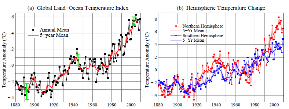
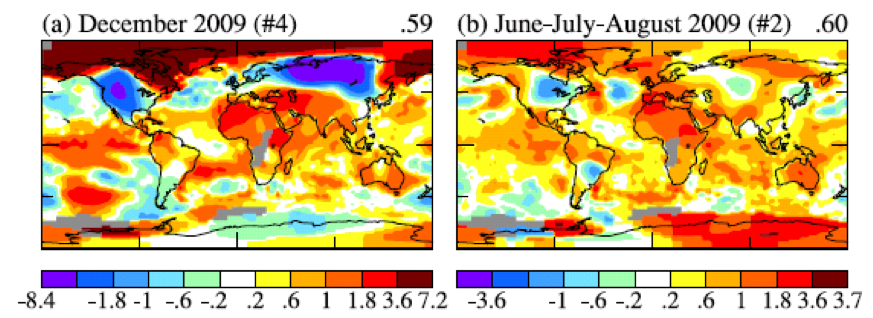
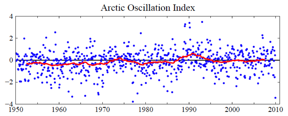
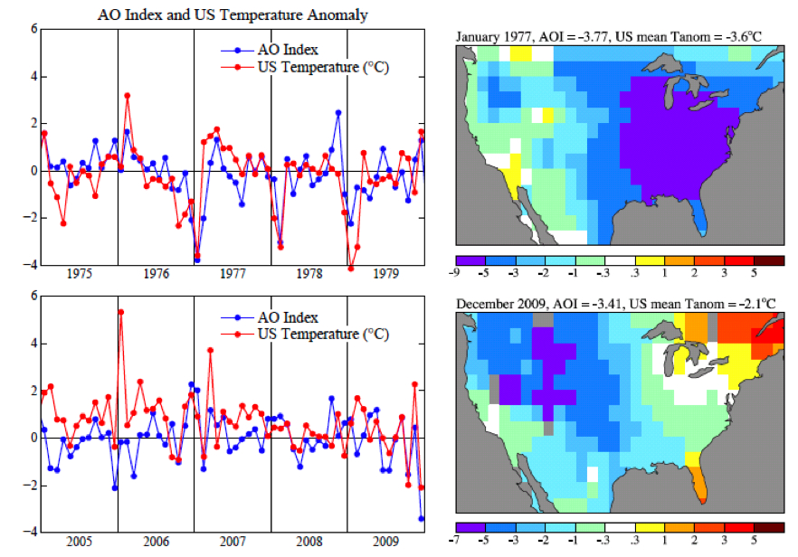
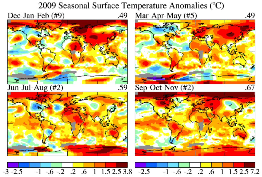
But blah, blah, everyone's heard that line before. A more thoughtful reply comes from meteorologist Jeff Masters, who explains how massive snowstorms in the Northeast are, in fact, quite consistent with a steadily warming world:

There are two requirements for a record snow storm:

1) A near-record amount of moisture in the air (or a very slow moving storm).
2) Temperatures cold enough for snow.

It's not hard at all to get temperatures cold enough for snow in a world experiencing global warming. According to the 2007 Intergovernmental Panel on Climate Change (IPCC) report, the globe warmed 0.74°C (1.3°F) over the past 100 years. There will still be colder than average winters in a world that is experiencing warming, with plenty of opportunities for snow.

The more difficult ingredient for producing a record snowstorm is the requirement of near-record levels of moisture. Global warming theory predicts that global precipitation will increase, and that heavy precipitation events--the ones most likely to cause flash flooding--will also increase. This occurs because as the climate warms, evaporation of moisture from the oceans increases, resulting in more water vapor in the air.

According to the 2007 Intergovernmental Panel on Climate Change (IPCC) report, water vapor in the global atmosphere has increased by about 5% over the 20th century, and 4% since 1970. This extra moisture in the air will tend to produce heavier snowstorms, assuming it is cold enough to snow. Groisman et al. (2004) found a 14% increase in heavy (top 5%) and 20% increase in very heavy (top 1%) precipitation events in the U.S. over the past 100 years, though mainly in spring and summer. However, the authors did find a significant increase in winter heavy precipitation events have occurred in the Northeast U.S.

This was echoed by Changnon et al. (2006), who found, "The temporal distribution of snowstorms exhibited wide fluctuations during 1901-2000, with downward 100-yr trends in the lower Midwest, South, and West Coast. Upward trends occurred in the upper Midwest, East, and Northeast, and the national trend for 1901-2000 was upward, corresponding to trends in strong cyclonic activity."

Meanwhile, it's worth noting the U.S. Global Change Research Program actuallypredicted stronger winter storms for the Northeast, in its 2009 report on potential climate-change impacts for the United States:

Storm tracks have shifted northward over the last 50 years as evidenced by a decrease in the frequency of storms in mid-latitude areas of the Northern Hemisphere, while high-latitude activity has increased. There is also evidence of an increase in the intensity of storms in both the mid- and high-latitude areas of the Northern Hemisphere, with greater confidence in the increases occurring in high latitudes (Kunkel et al., 2008). The northward shift is projected to continue, and strong cold season storms are likely to become stronger and more frequent, with greater wind speeds and more extreme wave heights."

Now, I don't think we can blame the current snow monstrosity on global warming—again, it's too difficult to attribute any single weather event to long-term climate shifts. The best we can say is that a warming climate is expected to create the conditions that make fierce winter storms in the Northeast and mid-Atlantic more likely. Or at least it will for awhile: If the planet keeps heating up, then at some point freezing conditions in the Northeast will become very rare, at which point snowstorms will, too But we're not at that point—the Earth hasn't warmed that much yet.

On the other hand, climate models do predict that snowstorms in the southernmost parts of the United States should become much rarer in the coming decades: There's plenty of moisture down south, but freezing temperatures are likely to decrease and the jet stream is expected to shift northward. So if those regions start seeing a sustained uptick in snowfall, then something's gone awry in climate predictions. But the blizzard in the Northeast, while miserable and incredibly disruptive, doesn't appear whack with long-term forecasts. (That's not exactly cheerful news for those of us who have to live here.)

(Flickr photo credit: errisiva)


Reblog this post [with Zemanta]
Read more…

Snowfall of February 8,9,10 2010

After Snowpocalypse: Extreme Weather on a Warming Planet

Digg this! Tweet this submit to reddit Share This

Tue Feb 09, 2010 at 05:42:38 PM PST

From Daily KOS

Ten to twenty more inches of snow are forecast for the mid-Atlantic region following the record breaking storm of February 5 and 6, 2010. The latest official forecasts predict the largest amounts, over 20 inches, will fall near Philadelphia.

Over a foot of snow is forecast for New York city and Long Island.

Multiple weather models show explosive development of the storm tonight when the low pressure area tracks over the Gulf Stream. Exceptionally rapid uplift of the warm humid air over the Gulf Steam tonight is predicted to cause the storm to develop rapidly while it produces heavy precipitation.

Because the Gulf Stream is running north of its normal position at warmer than normal temperatures, more energy (and water vapor) is available to fuel the storm.

Weather models are not in agreement over the amounts of snow that will hit eastern Massachusetts. Stay tuned for updates. The weather services models, which are the most reliable predict less snowfall in eastern New England than in Philadelphia. The Navy model, however, would give eastern New England massive snow amounts if it validates.

"Snowmaggedon" the record breaking storm of February 5 - 6, 2010

In Howard County, Maryland accumulations of snow greater than 3 feet were reported. Colesville, Maryland reported 40 inches - over 1 meter of snow.


In Howard county, between DC and Baltimore snow depths averaged over 30 inches.

"Snowmaggedon" was in the top 5 heaviest snows for Baltimore, Washington, DC and Philadelphia.

Top 9 snowstorms on record for Philadelphia:

  1. 30.7", Jan 7-8, 1996
  1. 28.5", Feb 5-6, 2010 (Snowmageddon)
  1. 23.2", Dec 19-20, 2009 (Snowpocalypse)
  1. 21.3", Feb 11-12, 1983
  1. 21.0", Dec 25-26, 1909
  1. 19.4", Apr 3-4, 1915
  1. 18.9", Feb 12-14, 1899
  1. 16.7", Jan 22-24, 1935
  1. 15.1", Feb 28-Mar 1, 1941

The top 10 snowstorms on record for Baltimore:

  1. 28.2", Feb 15-18, 2003
  1. 26.5", Jan 27-29, 1922
  1. 24.8", Feb 5-6, 2010 (Snowmageddon)
  1. 22.8", Feb 11-12, 1983
  1. 22.5", Jan 7-8, 1996
  1. 22.0", Mar 29-30, 1942
  1. 21.4", Feb 11-14, 1899
  1. 21.0", Dec 19-20, 2009 (Snowpocalypse)
  1. 20.0", Feb 18-19, 1979
  1. 16.0", Mar 15-18, 1892

The top 10 snowstorms on record for Washington, D.C.:

  1. 28.0", Jan 27-28, 1922
  1. 20.5", Feb 11-13, 1899
  1. 18.7", Feb 18-19, 1979
  1. 17.8" Feb 5-6, 2010 (Snowmageddon)
  1. 17.1", Jan 6-8, 1996
  1. 16.7", Feb 15-18, 2003
  1. 16.6", Feb 11-12, 1983
  1. 16.4", Dec 19-20, 2009 (Snowpocalypse)
  1. 14.4", Feb 15-16, 1958
  1. 14.4", Feb 7, 1936

The best source of imagery to see how the Snowmageddon storm developed is the CIMSS satellite blog. The first satellite image, a large animated gif, shows the movement of atmospheric moisture, in the water vapor channel. In the satellite movie, an intense upper level low moves from the Pacific into Baja California bringing much needed rain to the drought stricken southwestern deserts. The upper atmospheric wave moves over the Gulf of Mexico, pulling in tropical moisture in a long band that originates in the El Nino warmed tropical eastern Pacific ocean. A surface low develops from the strong atmospheric wave moving from Texas to the Gulf of Mexico then up into the Ohio valley. The strong upper atmospheric wave then develops a new surface low off of the Carolinas.

Then Snowmaggedon storm "bombed" when it tapped into the energy of the further north and warmer than normal Gulf Stream water. See Capitalclimate blog.

From my perspective the most interesting CIMSS satellite movie of Snowmageddon is the combined water vapor and lightning imagery. Click to watch the satellite image movie. At one point, apparently when the cold front hits the Gulf Stream, off of the Virginia capes a tight surface low explodes with lightning strikes. I screen captured this feature in the GIF movie.

The image shows that water vapor was moving from the Gulf Stream back towards Ohio. Snow fell from New Jersey to Missouri from the very long flow of easterly winds. The extended flow of easterly winds over the mid-Atlantic region for many hours gave the time needed to produce exceptional amounts of snow.

Dr. Jeff Masters, meteorologist, notes in his blog that the occurrence of two 100 year snow storms in Philadelphia in one winter is very improbable. And now we might get the third 100 year snow if the weather service's forecast is accurate.

Philadelphia has had two snowstorms exceeding 23" this winter. According to the National Climatic Data Center, the return period for a 22+ inch snow storm is once every 100 years--and we've had two 100-year snow storms in Philadelphia this winter. It is true that if the winter pattern of jet stream location, sea surface temperatures, etc, are suitable for a 100-year storm to form, that will increase the chances for a second such storm to occur that same year, and thus the odds have having two 100-year storms the same year are not 1 in 10,000. Still, the two huge snowstorms this winter in the Mid-Atlantic are definitely a very rare event one should see only once every few hundred years, and is something that has not occurred since modern records began in 1870. The situation is similar for Baltimore and Washington D.C. According to the National Climatic Data Center, the expected return period in the Washington D.C./Baltimore region for snowstorms with more than 16 inches of snow is about once every 25 years. This one-two punch of two major Nor'easters in one winter with 16+ inches of snow is unprecedented in the historical record for the region, which goes back to the late 1800s.

Discussion of Possible Causes of this Winter's Extreme Mid-Atlantic Winter Storms

Multiple factors have caused the conditions that led to these exceptional snow storms.

  1. El Nino

In El Nino years the trade winds weaken over the tropics while the westerly winds and the storm tracks move south. Westerly winds in the western Pacificstrengthen the flow of warm water that built up in the western Pacific when the trades were strong, back towards the Americas. This warm water combined with the southerly storm track leads to wet stormy winter weather from California to Texas to the Carolinas.

  1. The Arctic Oscillation

Warm air and high pressure over Greenland has diverted the storm track into the mid-Atlantic and into the Labrador sea. The strong storms in the Labrador sea are pulling cold Canadian air into the east coast on their back sides. A very strong storm that moved from the mid-Atlantic into the Labrador sea preceded the Snowmageddon storm. Cold air and high pressure over New England blocked it from moving up the coast. Many large mid-Atlantic storms are associated with lows near the Labrador sea.

  1. Climate Change

Some "conservatives" are interpreting this winter's extreme weather as an opportunity to claim that global warming isn't happening while simultaneously attacking president Obama.

This is the first time since record keeping started that two storms of such magnitude have hit the region during one winter. Already some localities are reporting the largest snowfall ever recorded.

To be sure, these events do not prove or disprove human caused global warming. But the momentum is now very much on the side of skeptical scientists who question these theories and President Obama should at least pull back from his awkward juxtapositions.

Mooney is quite correct that weather isn't climate, but he shows he doesn't understand the relationship between climate change and extreme weather events.

Warmer oceans increase the amount of precipitable water available to both summer and winter storms. Because the vapor pressure of water goes up in a rapid non-linear way with temperature, modest increases in sea surface temperatures can cause major increases in energy available to storms.

Dr. Kerry Emannuel, MIT Atmospheric Sciences professor has shown a strong correlation between tropical Atlantic sea surface temperatures and Atlantic hurricane energy.

Heating of the oceans increases the amounts of water vapor available to both winter storms and tropical storms. More extreme precipitation events of all kinds are likely as the oceans warm.

Weather and Climate Extremes in a Changing Climate (PDF)

The report

Weather and Climate Extremes in a Changing Climate. Regions of Focus: North America, Hawaii, Caribbean, and U.S. Pacific Islands", A Report by the U.S. Climate Change Science Program and the Subcommittee on Global Change Research. [Thomas R. Karl, Gerald A. Meehl, Christopher D. Miller, Susan J. Hassol, Anne M. Waple, and William L. Murray (eds.)]. Department of Commerce, NOAA's National Climatic Data Center, Washington, D.C., USA, 164 pp.

predicts an increasing number of strong winter storms with increasing levels of greenhouse gases.


Reblog this post [with Zemanta]
Read more…

Australia, Antarctica Linked by Climate


Picture of Western Australia

Heading south? When Western Australia grows dry, snow seems to build up on Antarctica's Law Dome.

CREDIT: TAS VAN OMMEN

Australia, Antarctica Linked by Climate

By Phil Berardelli
ScienceNOW Daily News
8 February 2010

Researchers have found an intriguing climate link between the southwestern corner of Australia and a region of eastern Antarctica. When the former suffers a drought, the latter is often battered with heavy snowfalls. More provocative: Several climate models suggest that human activity could be strengthening the connection.

The scientists noticed the link after nearly 30 years of studying Antarctic ice cores extracted from Law Dome, an ice field near Cape Poinsett, which lies almost exactly south of the southwestern tip of Australia. There they found evidence that the area had been experiencing abnormally large amounts of snowfall for several decades. They also knew that southwestern Australia had been suffering from severe droughts for approximately the same time.

So the researchers--climate scientists Tas van Ommen and Vin Morgan of the Australian Antarctic Division in Tasmania--examined the ice-core records from Law Dome going back 750 years. Then they compared the ice-core records with meteorological records to gauge precipitation patterns in southwestern Australia, as well as atmospheric circulation patterns in the Southern Hemisphere for the past 4 decades. As they report online this week in Nature Geoscience, about 40% of the rainfall variations in southwestern Australia were mirrored by snowfall variations at Law Dome. "The connection really stood out," van Ommen says.

More intriguing, the Law Dome snowfall patterns seem to have intensified over the past several decades. The pattern, van Ommen says, is "so unusual that we believe it lies outside the range of natural variation." Because of the link to southwestern Australia, he adds, "the implication is that the drought could be similarly unusual."

Indeed, climate models predict such an anomaly when humanmade carbon dioxide (CO2) emissions over the last century are factored in. According to the models, higher levels of CO2, coupled with reductions in atmospheric ozone, create an atmospheric circulation pattern in the Southern Ocean that brings drier air to the farming regions of southwestern Australia and heavier snows to Law Dome. But as the models show, by boosting CO2 and cutting ozone, the normal cycles can be cut, and that is what seems to be happening now.

It's "a very solid piece of evidence" for the influence of human activity on regional climates, says climate scientist James White of the University of Colorado, Boulder. "Can very odd climate just happen at a time when we humans are also causing unusual climate change?" asks White, who specializes in arctic research. "I wouldn't bet the farm on it."

Reblog this post [with Zemanta]
Read more…

Link Bypass Calculations in SWMM 5

SWMM 5 uses 2 to 4 iterations to solve the node continuity and link momentum/continuity equation at each time step. Nodes ALWAYS use 4 iterations but links may use only 2 iterations if BOTH the upstream and downstream nodes are converged. If the upstream and downstream nodes are converged then the link flow calculations are bypassed for one or two iterations. This speeds up the SWMM 5 engine because most of the time is used in calculating the link flows and not the node depths.

  1. Links in SWMM 5 bypass the link calculations if BOTH the upstream and downstream nodes are converged AND there has been at least two iterations. There is a maximum of 4 possible iterations in SWMM 5.
  2. A node is converged if the current iteration value and the last iteration value of the node depth is less than 0.005 feet (the internal units for SWMM 5 are American Standard Units).
  3. If a node is no longer converged on the 3rd and 4th iteration the flow computations for the links will resume.
  4. In a typical model 50 to 70 percent of the link iterations after

Figure 1. Iterations in SWMM 5

Read more…